
As important as developing your brand identity and marketing strategy, the right website design plays a crucial factor for your business. You want your website to look professional and good, but never at the expense of a good-for-nothing customer experience. Minimalist website design is comparable to elegance in architecture or other art forms with a rich history. Most of us have encountered websites packed with features, graphics, and display ads that are far from simplistic.
You are probably not fond of those jammed websites!
Many well-known businesses promote themselves solely through simplicity. This style seems more likely to be identified as informative, convenient, and effective. You want your brand messaging to inspire and convey emotion and engagement to your website visitors.
Because of the success of this strategy, many small business owners and real estate businesses have focused on reducing rather than increasing visual elements on their website pages.
What is a Minimalist Design?
The art of ‘less is more’ is known as minimalism. Designers frequently apply the term less is more when it comes to minimalist website designing.
It is important to understand that minimalist design is really about communication as well as graphic representations and aesthetics. Choosing a straightforward approach that focuses on messaging is the best way to convey information and grab attention.
Google is among the first to implement the minimalist design. They decided to be straightforward for impressions and attraction, and that pattern is still being continued now.
The general guideline of less is more has helped real estate professionals and small business owners to increase website traffic.
Did you know that your website could lose as many as 8% of your conversion when it loads more than one second?
Almost 50% of online consumers expect your website to load faster than two seconds. That’s why you might want to consider switching to a minimalistic website design.
5 Ways to Create a Minimalist Website
-
Use the whitespace effectively
When you remove excessive parts of a website, you’ll notice some vacant space. Negative is a term used to describe the interface’s whitespace. It is also referred to as the ‘foundation’ of all minimalist styles. Even if it’s empty, it’s significant in conveying a message to consumers. It eliminates distractions and inconvenience.
This focuses attention and assists visitors in obtaining information straight without having to face additional flashy graphics.
When it comes to creating negative space for your website, there are several things to consider:
- The content on the page is critical to keep
- Simplicity’s hierarchy
- The aspects of information and interaction
- Variations in negative space for various resolution
These aspects must be taken into account for each webpage design.
-
Black or white
It’s a common misconception that minimalist websites would only be black and white. That is not entirely true. Using whatever colors you pick is crucial not to overwhelm but guide attention. The primary rule of color choices helps highlight your content, so there’s no need to go overboard with your corporate style.
Many attractive minimalist real estate websites utilize monochromatic color with maybe one or two splashes of color for fine-tune shading.
Although different colors and tones would never be considered minimalistic, the pure black and white typography have the potential to oversaturate your website’s overall design.
You can always use vibrant colors to complement the area’s balanced and fresh look. With the right color combination usage, you can eliminate overpowering negative space. Your website will make a great impression and capture attention if done correctly.
It may appear to be a minor detail, but it is just as important in minimalistic design as ever.
-
Flat textures
Such flat designs do not include visual aesthetics, gradients, shadows, or specific graphic elements. All the interface components appear to be clean and elegantly displayed. Putting all the pieces flat can help highlight your website content.
Flat and simple layouts are two separate elements.
A minimalist website can feature one 3D animation in the center with shades and other effects while being simple in the process. You may find it easier to use flat textures.
When deciding on a web design strategy, take note of the overall business design or any themes you have in place for other pages.
-
Large background elements
Large background elements are still popular, which makes sense.
Having a single large video or image as background continues to bring attention to an important message on your web pages. The design has used a huge background image with possible motion effects. Because there is essentially nothing on those pages, this allows for creativity and minimalism.
The background is usually a major factor in how minimalism plays on your website. It serves as the main storyteller because fewer elements are displayed on your home page or other pages.
-
Grid layouts
Minimalist websites are especially fond of grid designs. Such a structure makes information arrangement easier and aesthetically lightens the website. It’s easy to see on blogs and other digital platforms that display new items in grids, even with a flurry of fresh content coming.
Grids are ideal for creating a customizable rendition for handheld devices, such as smartphones and tablets. It’s not about simplicity as a whole, but rather something that can generally thrive effectively and present essential information on the homepage.
It’s clear where to look for it, but this is especially true for clean lines on your minimalistic website. Anything you want to add, photos, taglines, or thumbnails must be seen clearly there.
Why Your Website Should Have a Minimalistic Design
You may be wondering why minimalism is so hyped in design today? Here are a few benefits that minimalist design provides.
- Displays content clearly
Content is king, and the king should be honored by design. One of the key purposes of simple design is to draw more attention to your website and content. Minimalism makes it a lot easier to absorb information, as consumers don’t need to spend hours separating important points from masses of information.
- Better website performance
Because minimalist websites have fewer elements, they quickly perform better and streamlined web pages.
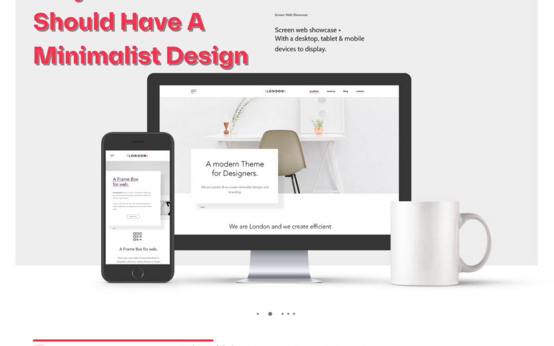
- Create a design that fits all screen sizes
Many digital designers regard minimalist as a strategy for superb screen usability with the widespread use of technology devices.
Having fewer items on your web pages allow visitors to focus on crucial information rather than hopping around in pursuit of information. Another advantage is a quicker response time, which is critical in a society where no one appears to have any spare time.
How we can help you optimize your website
Minimalism is a web design style that stresses balance, clarity, and contrast. They often feature pictures of white space, large graphics, bold colors, and clean typography.
It’s important to understand that minimalism is more than visual aesthetics and focuses on functionality. That’s why you should pick the right technology partner to create your website.
Hoopjumper can help you achieve a custom-built, responsive website tailored to your business needs and for your customers to have a more enjoyable experience.
Don’t hesitate to reach us and learn more about website service packages with any ideas you might have.