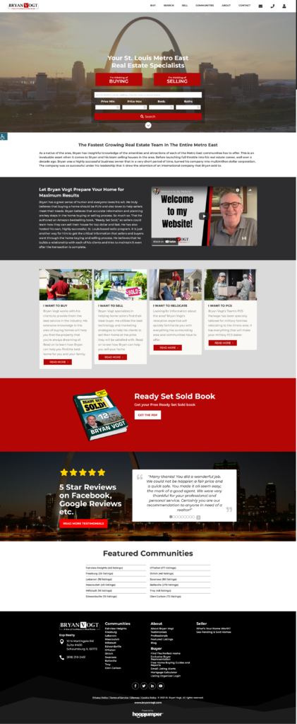
In this week’s blog, we’ll talk about the seven homepage must haves.
This is to help you evaluate what you need to have if you’re building a new website, or whether or not, if you already have these, they have to be updated.
Your website’s homepage is your business’ virtual front door.
You need to make sure that you have these homepage must haves in order to bring more viewers in.
The more viewers you have, the more opportunities you get to turn them into leads, and eventually, customers or clients.
The principle behind these homepage must haves is simple: less is more.
Let’s look at these seven homepage must haves for your website.
1. Beautifully Designed Logo
Your logo is a visual representation of your business.
It is one of the main things that stick in the mind of the viewer when they visit your website.
Most logos are placed on the top-left section of the homepage, but some websites do place them on the center.
The most important thing to keep in mind is that you need to make sure your logo makes your business stand out.
If you need a good logo for your business, click HERE to find out how HoopJumper can help you create one.
2. Relevant, Memorable, and SEO-friendly Heading and Subheading
Aside from the logo, the header and subheader texts need to be clear and concise.
Website visitors typically take anywhere between 5 to 10 seconds looking at your homepage before they decide whether they want to scroll down or just visit another site.
You need to catch their attention by making sure that they understand clearly what your company is about in the most interesting set of phrases possible.
Speaking of interesting phrases, don’t just think of phrases that capture the attention of your website visitors – make sure search engines like Google or Bing capture them too.
This is where SEO (search engine optimization) comes in.
Having your homepage search engine optimized helps it secure a higher position on web searches compared to a non-optimized one.
3. Enticing Call to Action
Don’t forget this homepage must have – your website is your primary marketing tool, so it has to have a call to action.
When people visit your website, they’re not just there to look at it – they’re looking for the next step.
Give your website visitors a goal by placing a carefully-worded call to action so they know what they should do next, and they get added into your marketing and sales funnel.
A Call to action can be typically placed immediately below the header and subheader, but you should have more than one on the homepage.
If you have a long homepage, try to have the call to action in several places.
4. Eye-Catching Header Video or Photo
Website visitors respond to images better than they do to text, so don’t be stingy in putting images on your homepage, especially in the header section.
Of course, you have these two things to consider:
First, your photo or video needs to be relevant. You need to show your visitors something that will connect to what your business does.
If you run a real estate business and yet show a video of a doctor happily engaging with a patient, then it would just confuse the visitor.
Instead, use photos or videos that best represent what your business can bring into your website visitors’ lives.
Second, optimize your photo or video before uploading them to your homepage.
If your photo or video is too large, it would cause your homepage to load slowly, which would then result in the visitor leaving the page before they even get to see it.
5. Minimalist Color Scheme
Less is more. This is a universal truth in marketing.
People don’t like to get overstuffed with colors when looking at a page, especially if they are looking at a professional website.
You want people looking at your content, not at its design.
Having a beautifully designed website is needed, but you would want your visitors to buy your product or service, not just admire your website.
Typically, professional website color schemes have a background color (usually white, grey or black), a primary color and one secondary color. Take a look at one of our client websites:

6. Clear Navigation Menu
This is one of those homepage must haves that you should never get wrong.
Navigation menus are typically placed at the top of the homepage, or on the sides where they popup when the visitor hovers over a small icon that can be found on either the top right or top left section of the page.
Keep the relevant pages at the top of the menu. If you have too many pages, group them into categories, and add them as sub-items on your navigation menu.
Make sure that your website visitors can clearly see the pages that you want them to go to on your menu, so they don’t have to spend time wondering where they should be looking at.
7. Professional Typography
Your website visitors don’t just judge your homepage text based on the content; they also look at its font.
In a previous blog post we detailed how important typography is for retaining visitors.
To put it in a nutshell, the font you opt to use will send a message to your visitor on whether you are a professional or not.
Your website’s homepage is your business’ digital lobby. You have to make it appealing enough so that it captures visitors and turns them into leads.
And you don’t have to do that alone.
HoopJumper custom-designs and brands websites that will get interested prospects to contact you so you can capture and nurture that lead.
If you are interested in learning more about how HoopJumper can help you place these homepage must haves on your website, don’t hesitate and contact us today.

